Concept brand Sparkling drinks
wattlepop
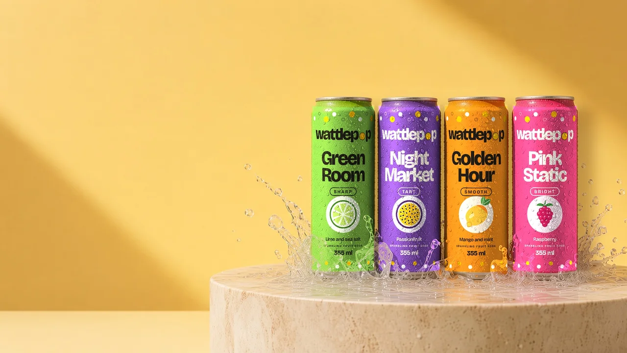
Four flavours. Four moods.
01 The brief
A sparkling fruit soda sold by the dozen, loud on the shelf and simple to shop.
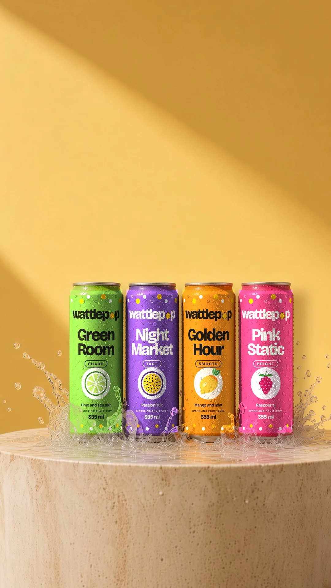
Four flavours had to be easy to tell apart in a full fridge and on a small phone screen, and building a mixed box had to take seconds.
wattlepop is a brand I made up to try ideas, so this is the brief I set myself.
02 The brand system
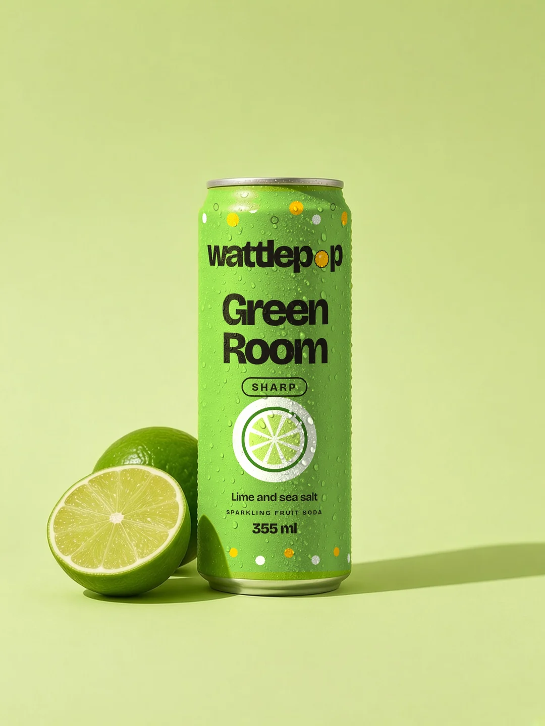
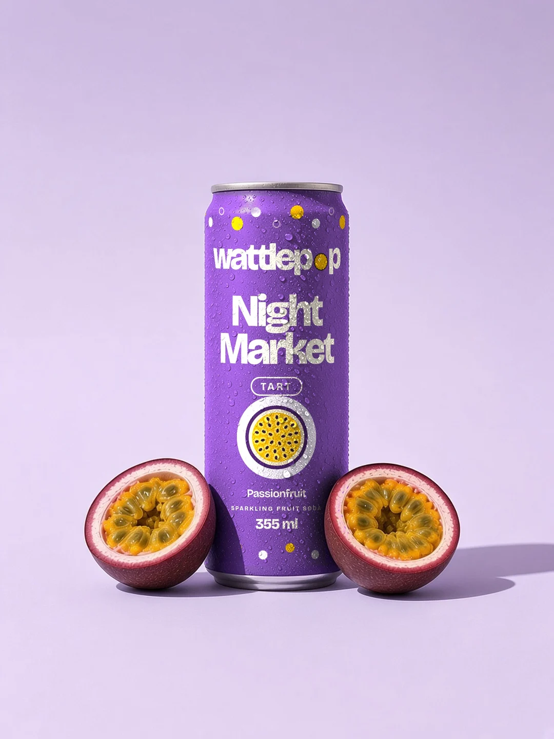
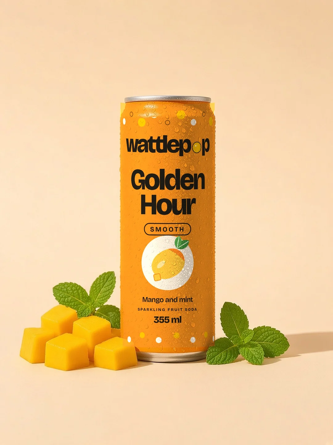
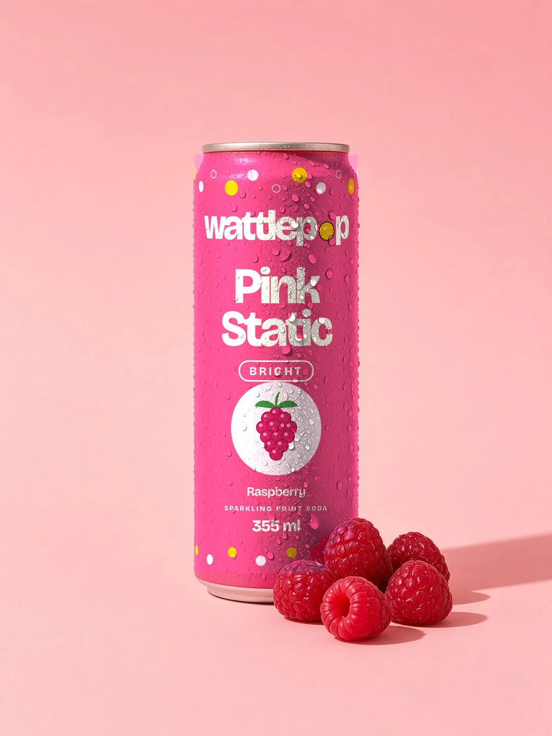
A wordmark set tight, with a wattle puff for the o. Each flavour owns one colour and uses it edge to edge, on the can, the label and the product page.
 Logo
Colour
- Wattle gold#F5B301The brand colour
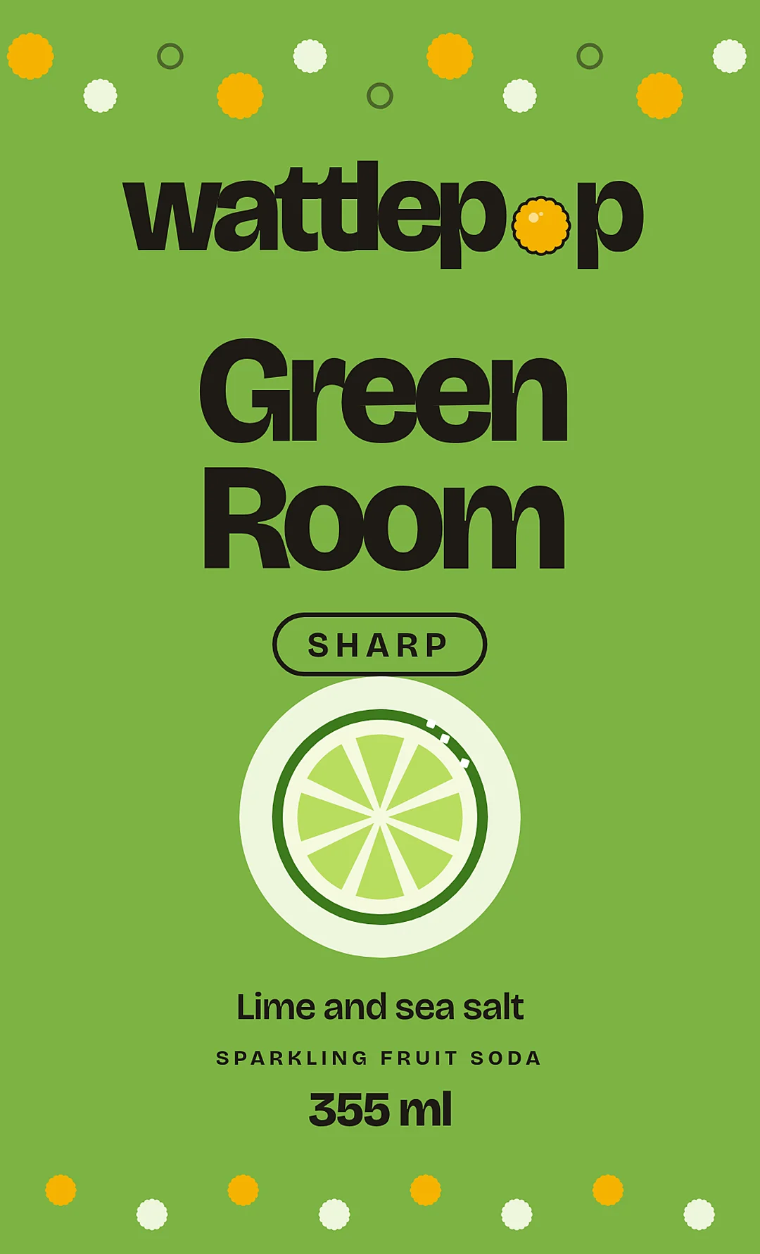
- Green Room#7CB342Lime and sea salt
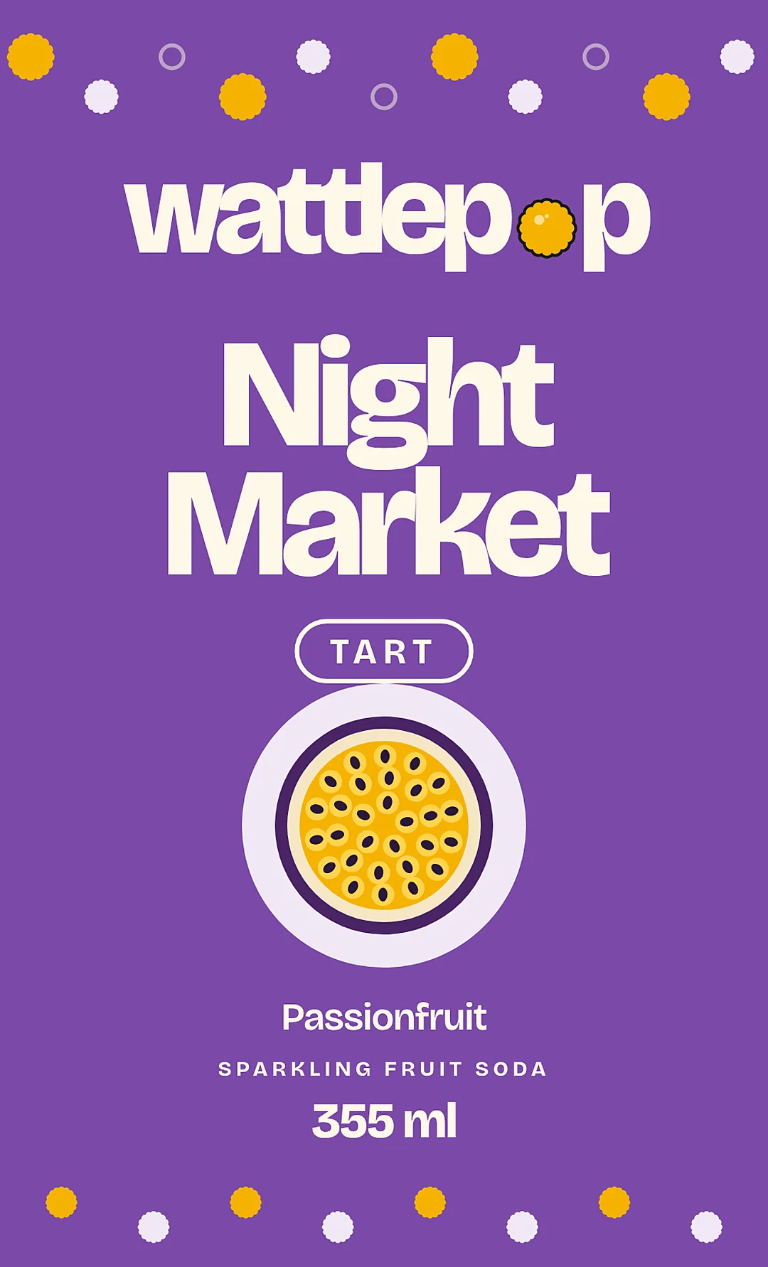
- Night Market#7B4AA8Passionfruit
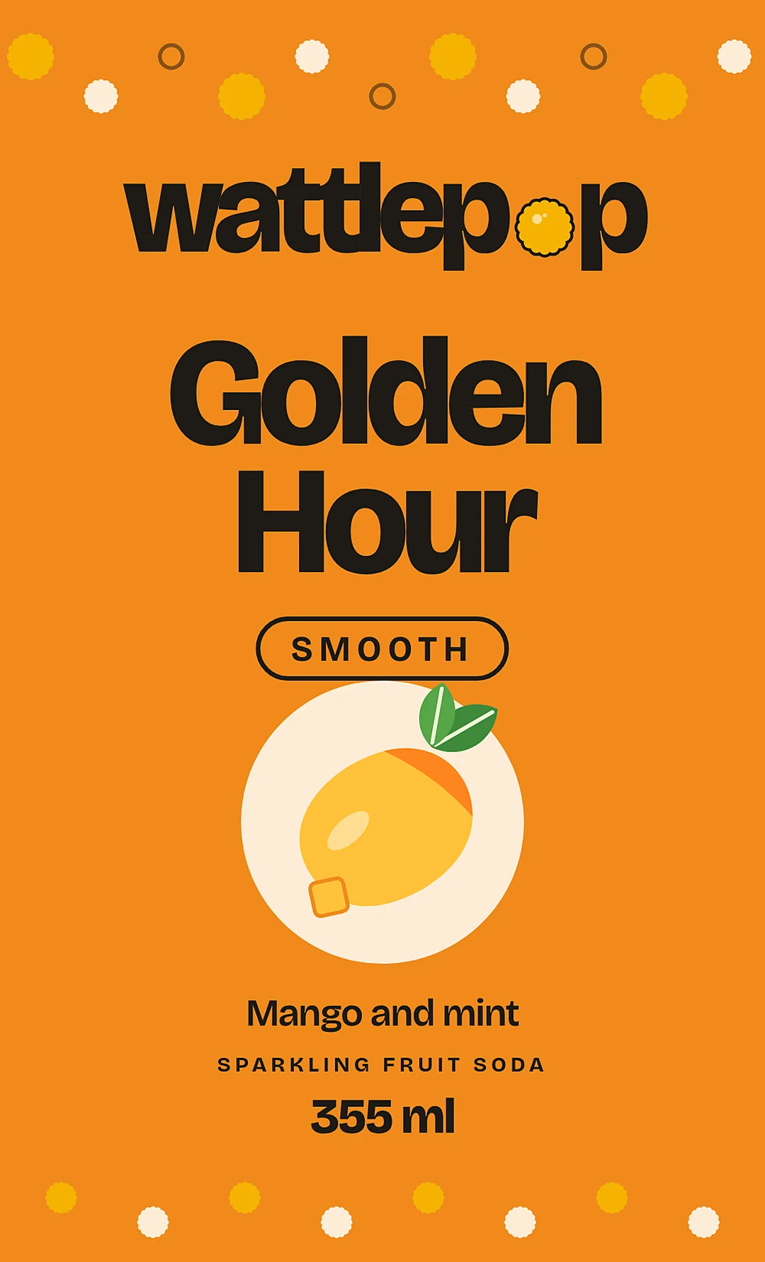
- Golden Hour#F08A1CMango and mint
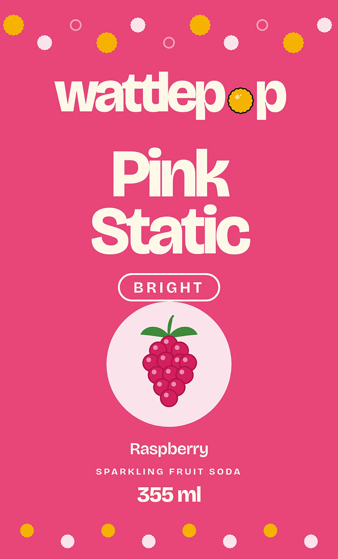
- Pink Static#E8457ARaspberry
- Cream#FFF8E8Page background
Type
Cold fizz. Real fruit.
Bricolage Grotesque for display. One family. Extra bold and tight for headlines, regular for reading, spaced caps for labels.
Packaging
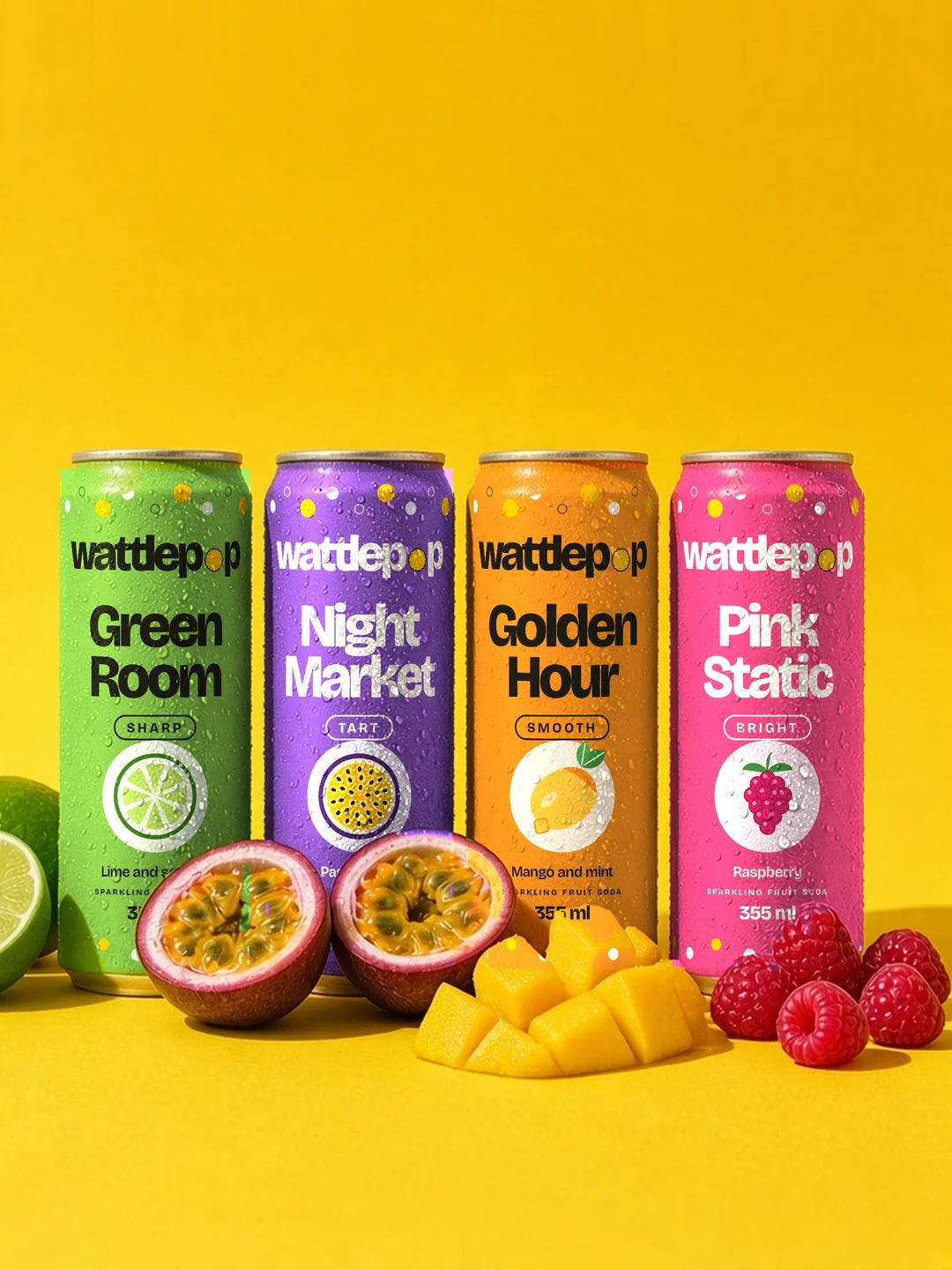
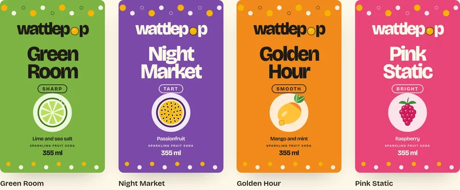
Flavour first: one colour per can, a mood word and a fruit on every label, with the puff pattern band top and bottom.
03 The finished store
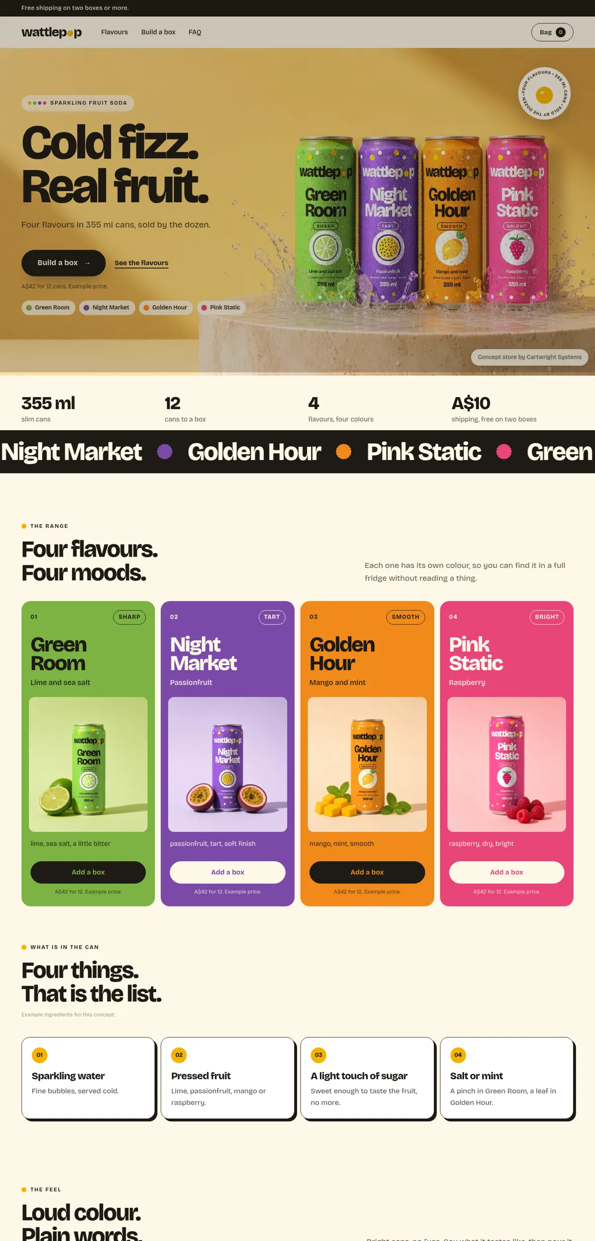
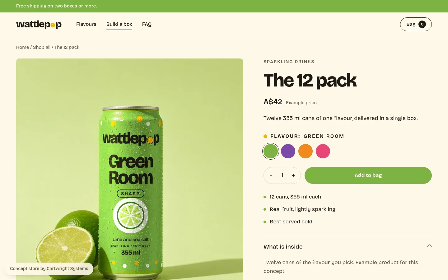
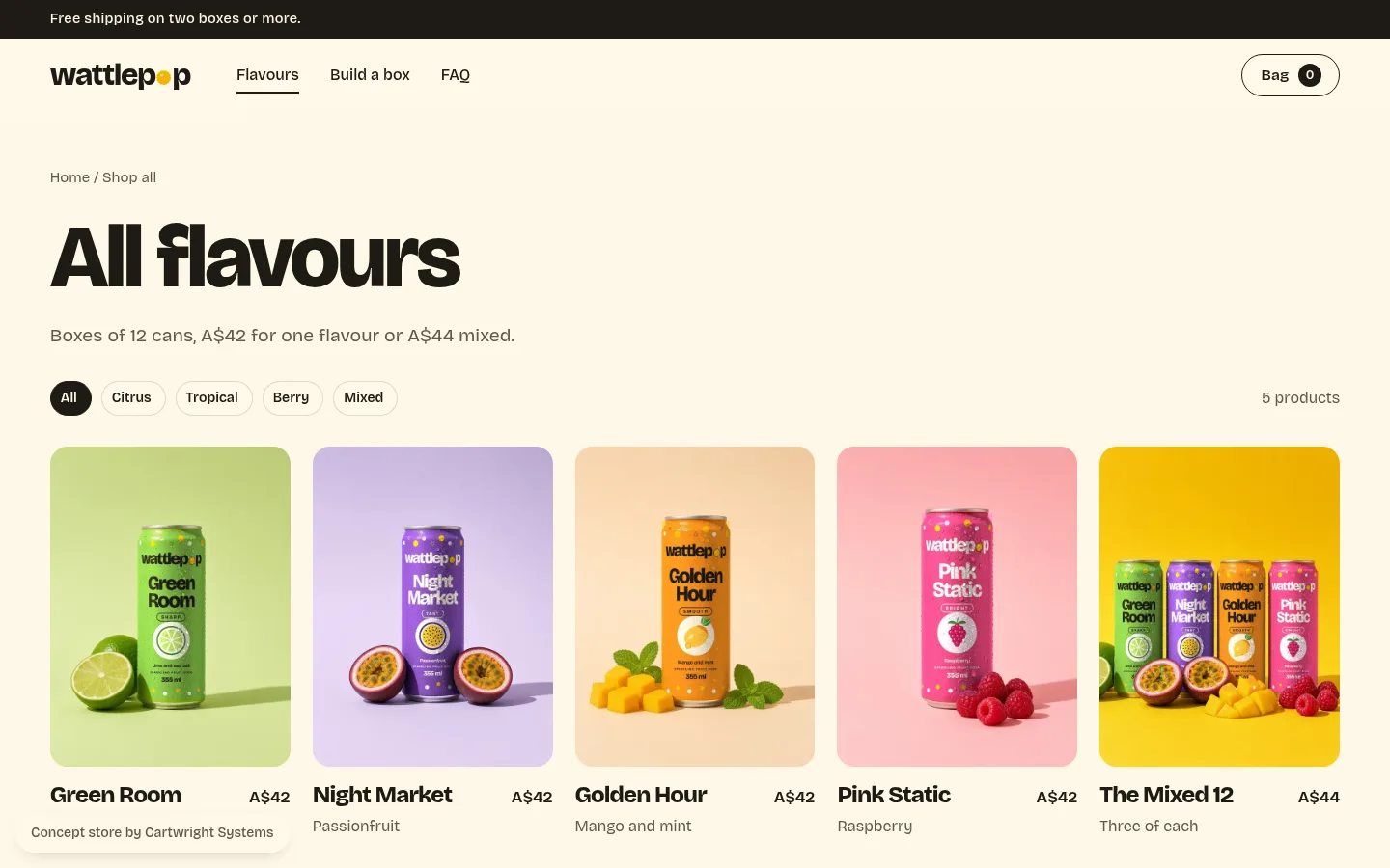
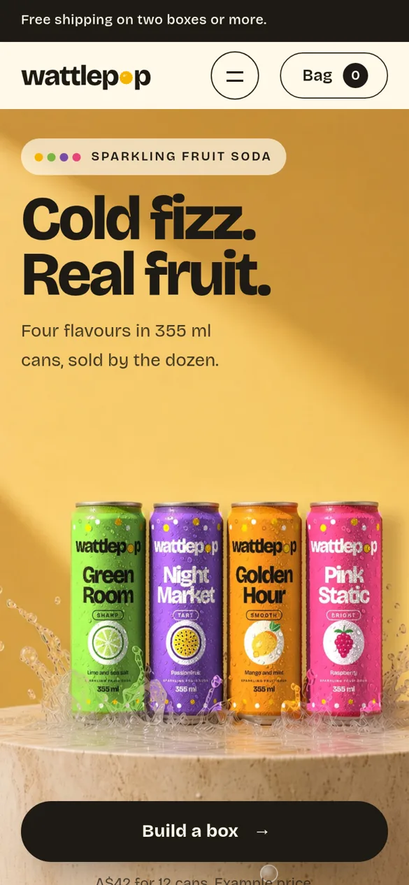
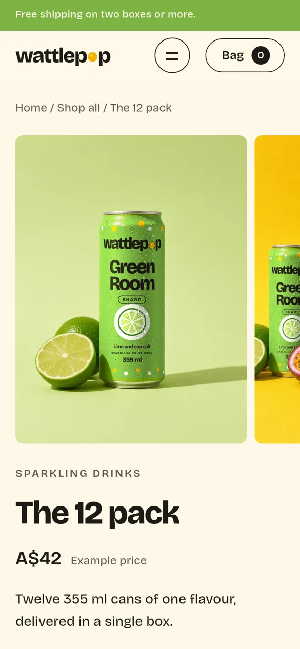
Home, collection, product and cart pages, built in Shopify and working on phone and desktop.
Why it looks like this
- 1
Every flavour keeps its own colour, from the can to the card to the button.
- 2
A ticker of flavour names gives the page a loud, moving start.
- 3
Four flavour cards, each with its can, its colour and its own add button.
What I made
- Name, logo and mark
- Colour palette and type system
- Packaging artwork
- Art direction for the product images
- Home, collection, product and cart pages
- A one page brand book
Like a look? See one made for your store.
Send your store link and I will design a custom homepage for you, free. You only pay if you want it built.