Brand book
wattlepop,
in one page.
The logo, colours, type, pattern, can and voice behind the store. Everything here is drawn for this concept.
Logo
A wordmark set tight, with a wattle puff for the o. The puff also works alone as the mark.
Colour
Wattle gold leads. Each flavour owns one colour and uses it edge to edge.
Type
One family, Bricolage Grotesque. Extra bold and tight for headlines, regular for reading, spaced caps for labels.
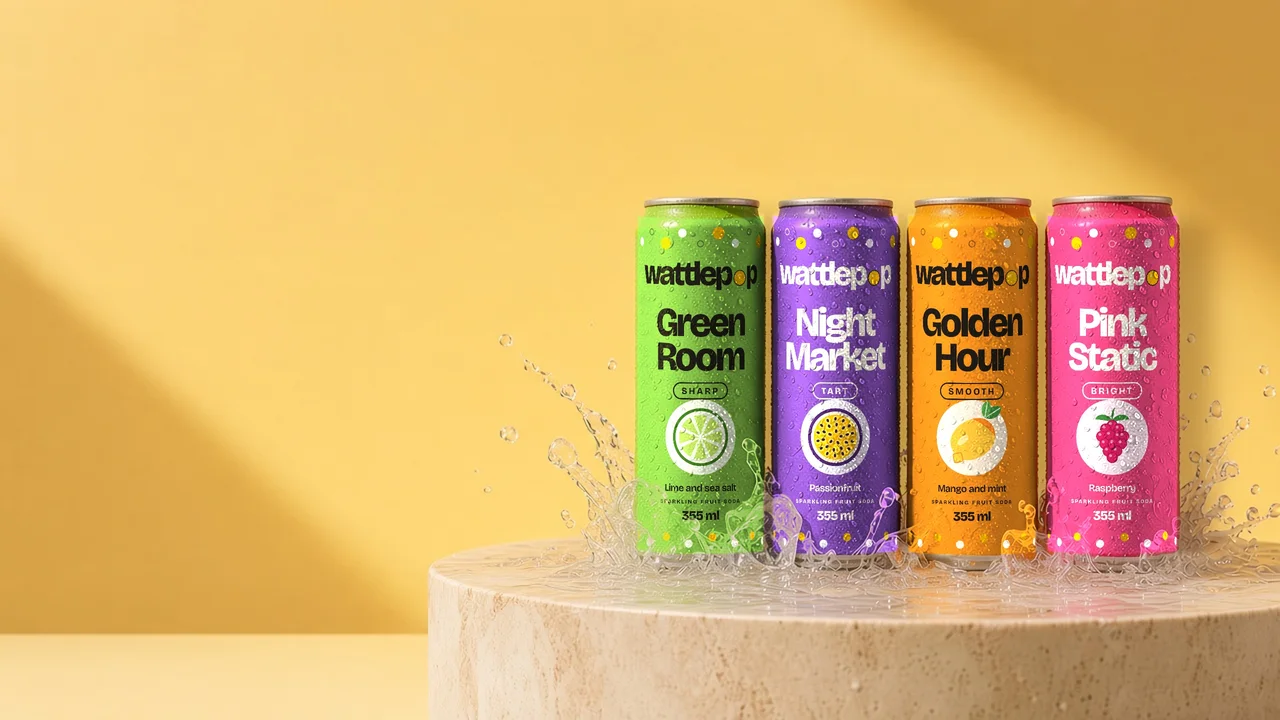
Four flavours in 355 ml cans, sold by the dozen. Each one has its own colour, so you can find it in a full fridge.
The range
Pattern
Puffs and bubbles in the brand colours. Used on panels and the sign up band.
Labels
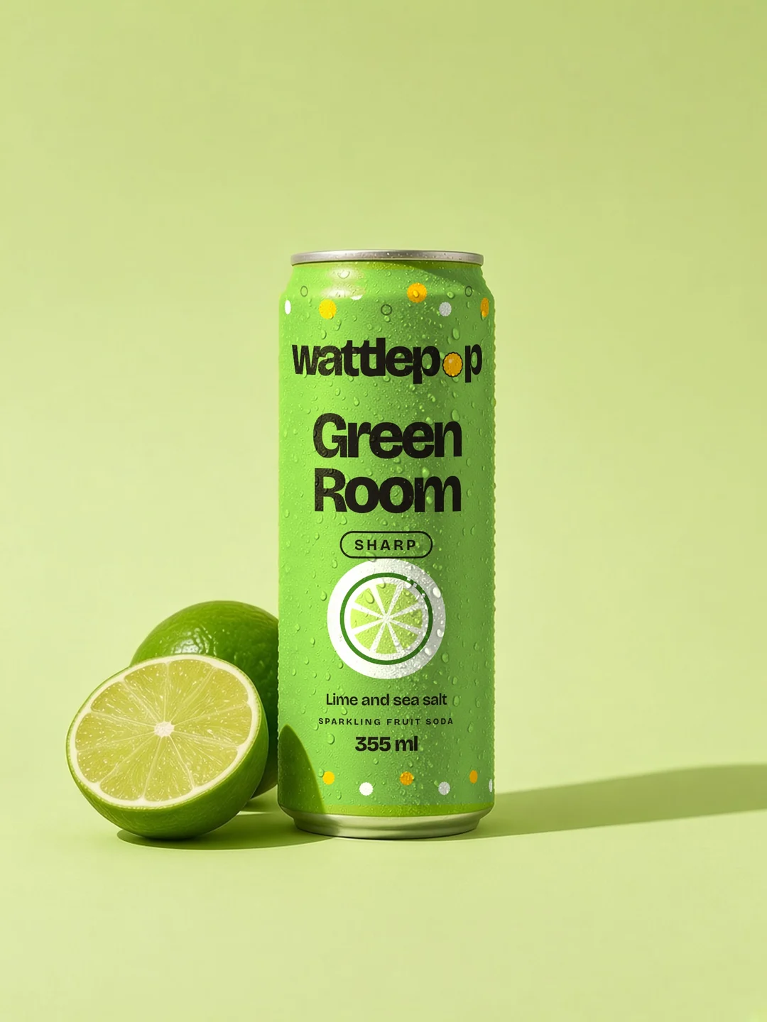
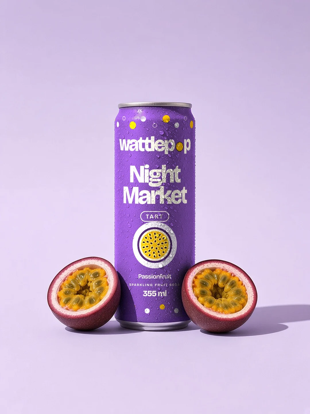
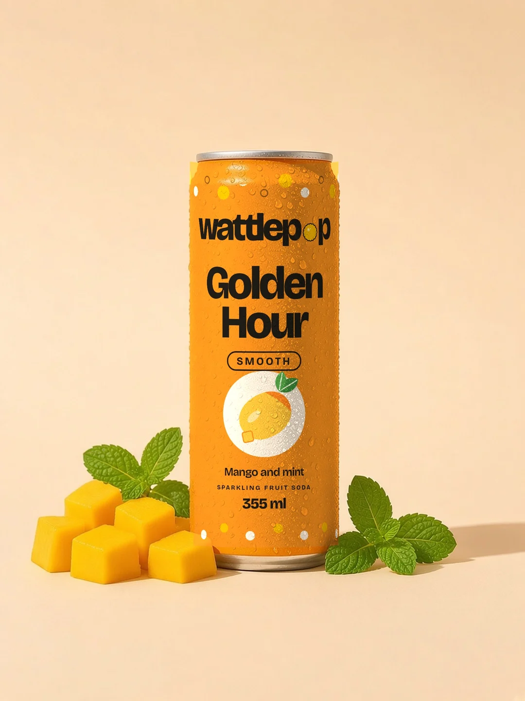
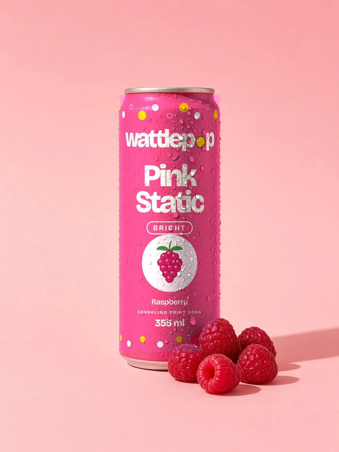
Flat label artwork, drawn as vector. Wordmark, flavour name, mood word, fruit, and the pattern band top and bottom.
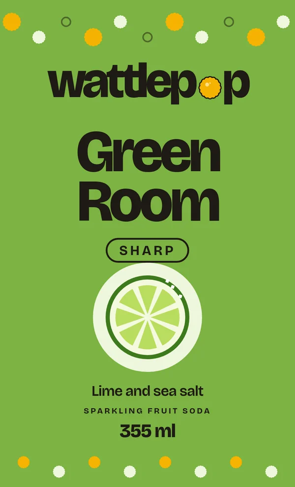
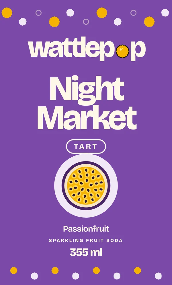
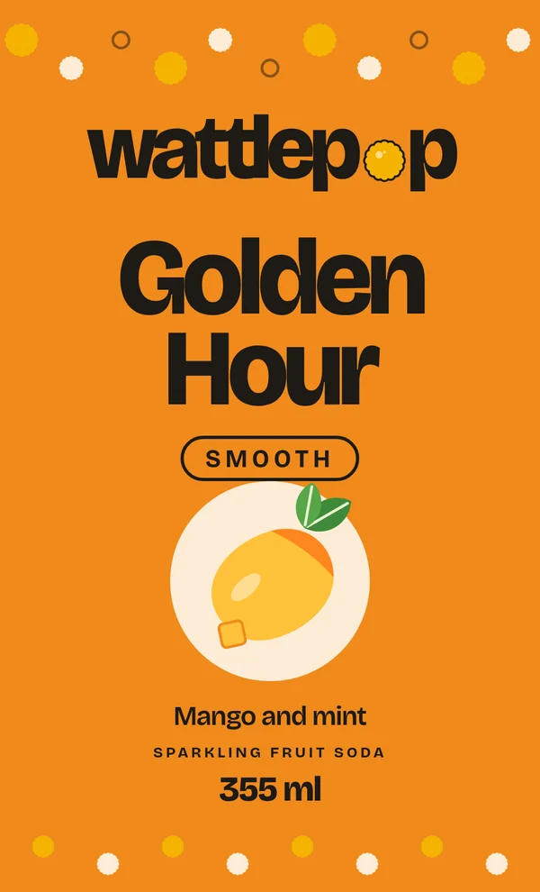
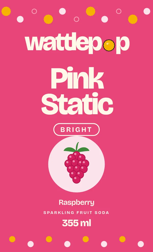
Can
Flavour first, one colour per flavour, a mood word and a fruit on every can.
Voice
Short, bright and plain. Say what it tastes like, then stop.
We say
- Cold fizz. Real fruit.
- Sharp lime with a pinch of salt.
- Four flavours. Four moods.
- New flavours land here first.
We skip
- Big health claims
- Long words where a short one works
- Exclamation marks
- Anything we cannot show on the can