Concept brand Skincare
Saltlight
Skin care with nothing extra.
01 The brief
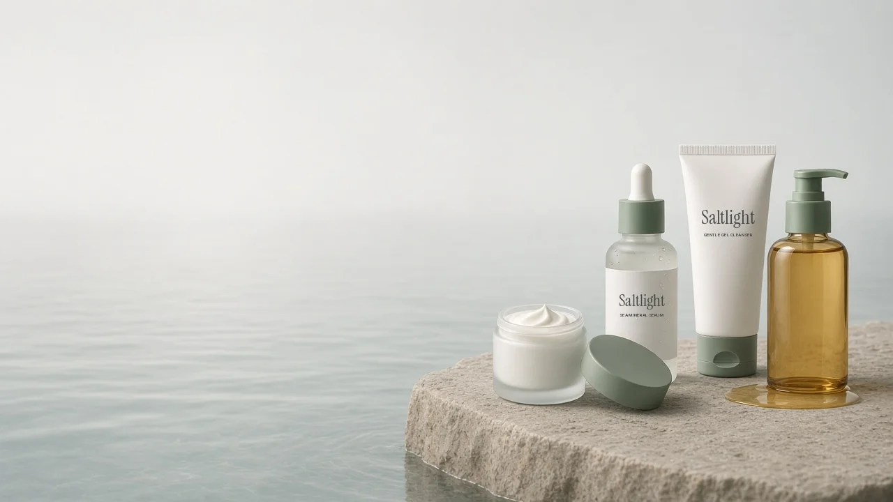
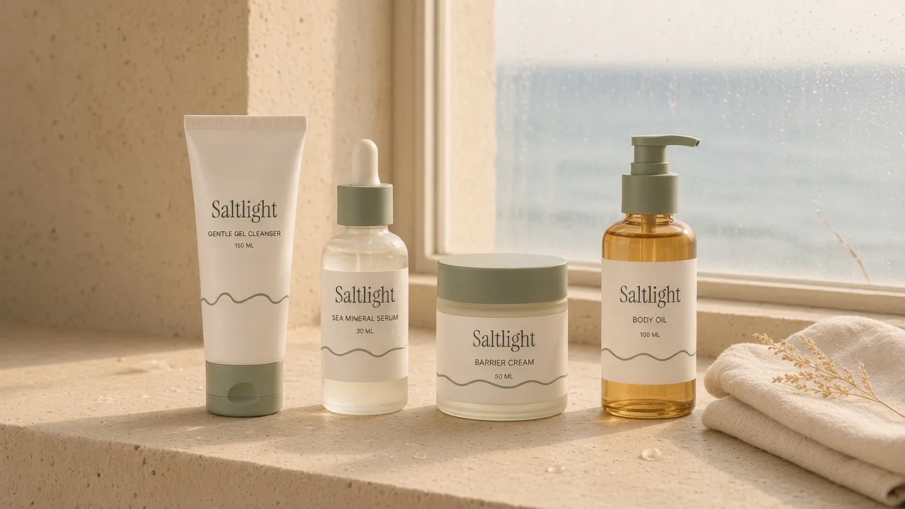
Four product skincare for people who want less.
The routine had to read as one system, morning and night, with nothing extra on the label and nothing extra on the page. Pick a routine, add it, done.
Saltlight is a brand I made up to try ideas, so this is the brief I set myself.
02 The brand system
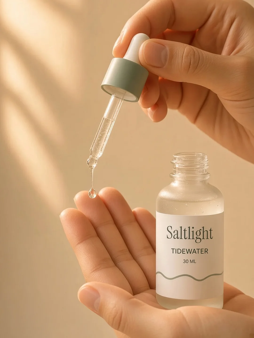
A tide line drawn under the wordmark, and sea glass colours. All four labels share one layout, so the range reads as a single routine.
 Logo
Colour
- Kelp#2F4A43Type and buttons
- Ink#1E2B2EDark bands
- Amber#C9A15BOil and accents
- Sea glass#A9C1B6Soft panels
- Sand#ECE4D6Page background
Type
Nothing extra.
Fraunces for display. A soft serif with a little warmth. Inter keeps ingredients and sizes clear.
Packaging
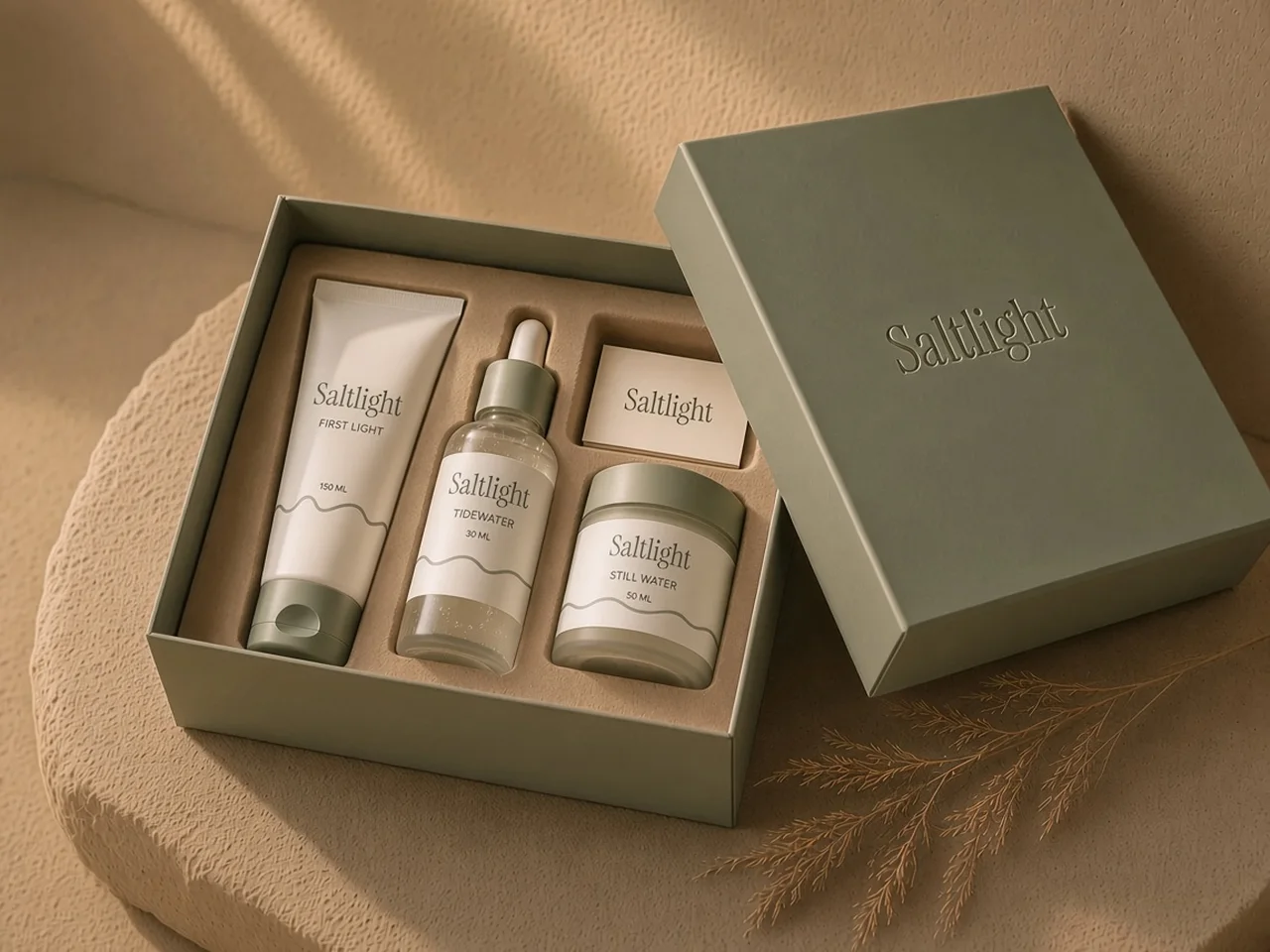
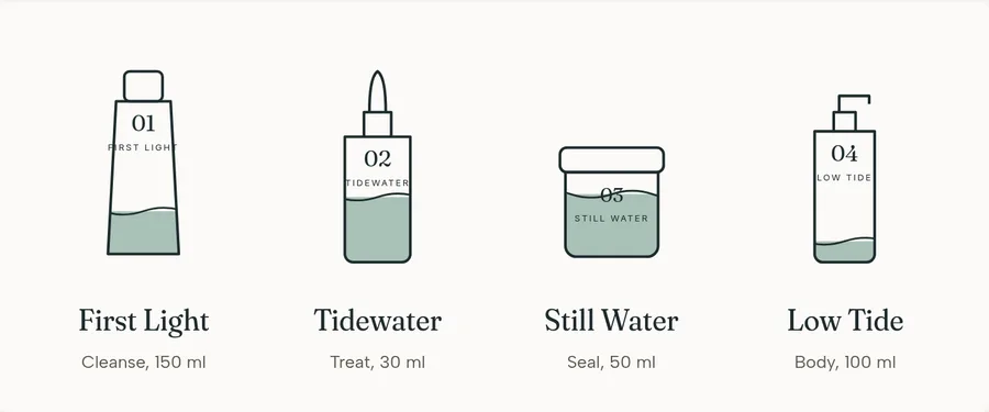
A sea glass box that holds the whole routine, with a card that lists the order: cleanse, treat, seal.
03 The finished store
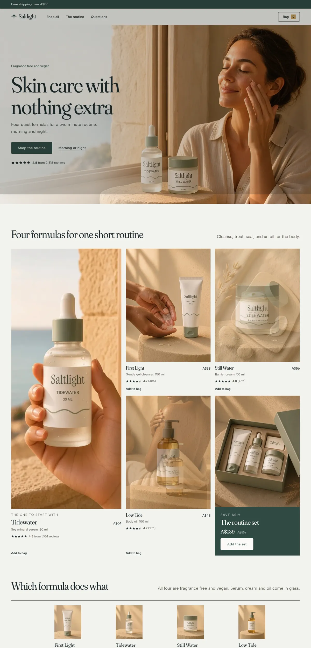
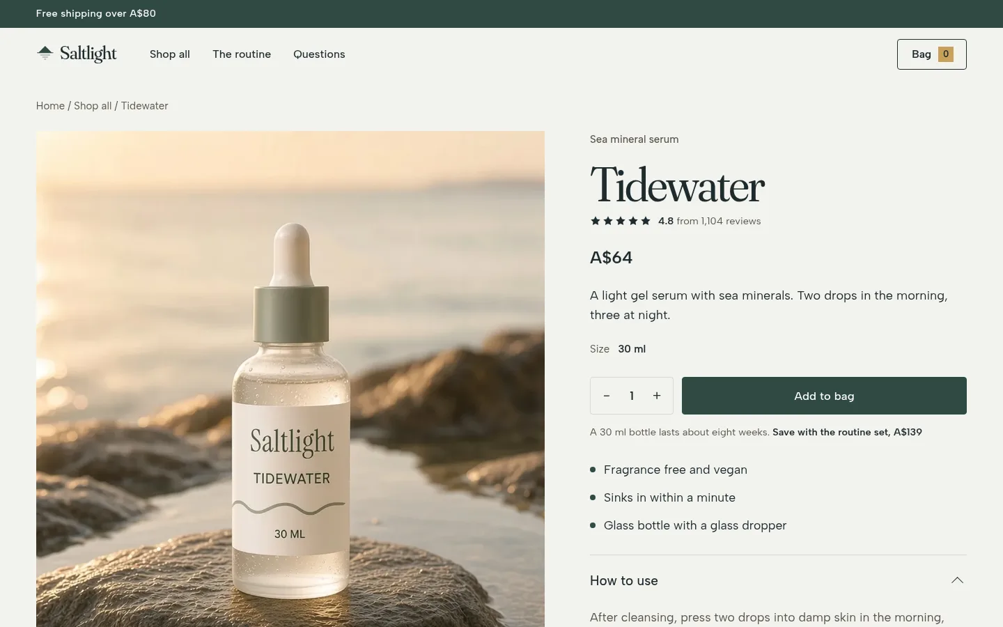
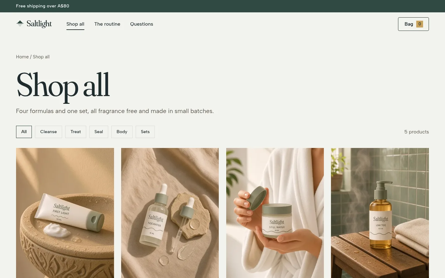
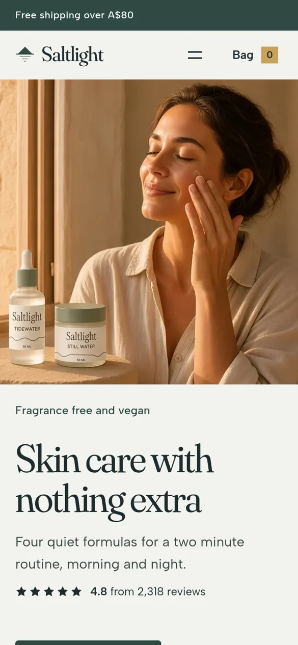
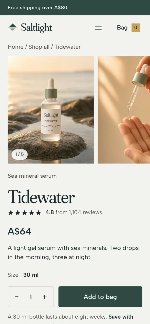
Home, collection, product and cart pages, built in Shopify and working on phone and desktop.
Why it looks like this
- 1
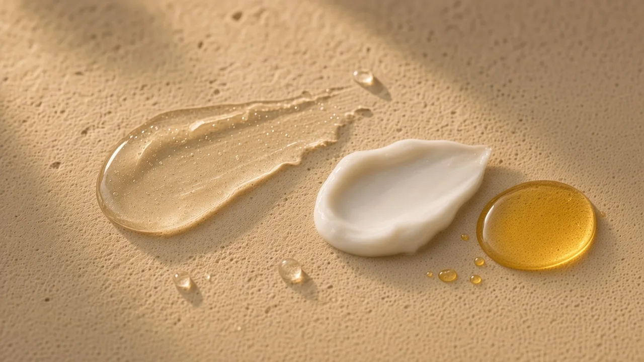
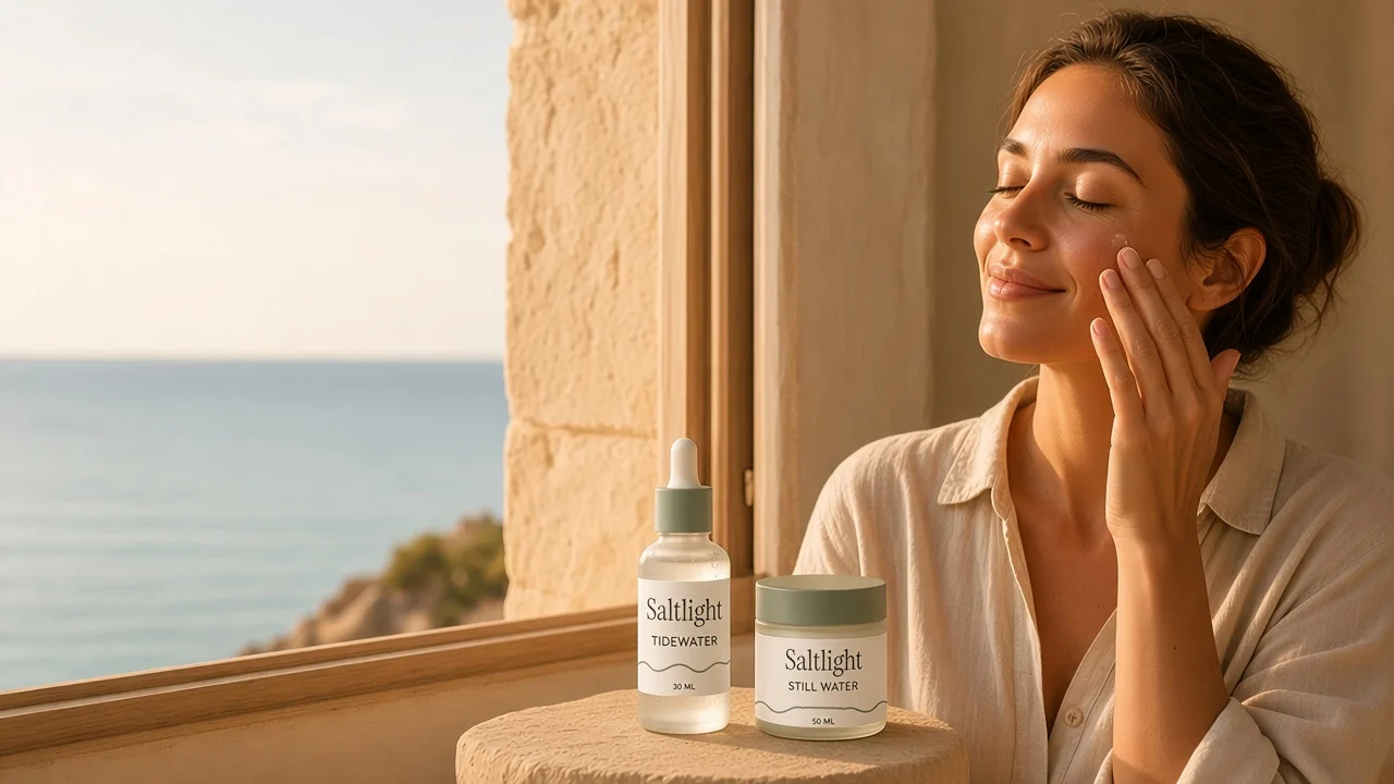
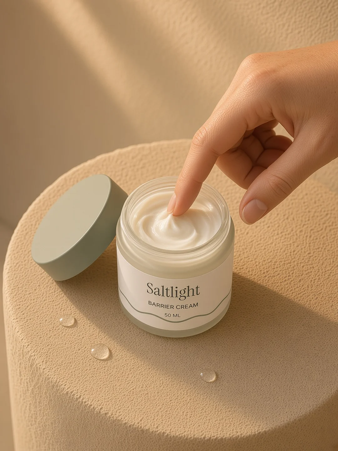
Warm photos and one soft serif, so the page feels slow and calm.
- 2
Four formulas shown as one short routine, not a long catalogue.
- 3
The routine set sits in the grid in the deep green, so it stands apart from the single products.
What I made
- Name, logo and mark
- Colour palette and type system
- Packaging artwork
- Art direction for the product images
- Home, collection, product and cart pages
- A one page brand book

Like a look? See one made for your store.
Send your store link and I will design a custom homepage for you, free. You only pay if you want it built.