Saltlight,
in one page.
The mark, colour, type, pattern, labels, box, motion and voice behind the store. Everything here is drawn for this concept.
Logo
A salt crystal half above the horizon: sunrise over the sea. The lines under it are its reflection. The wordmark is Fraunces, set tight.
Colour
Salt and kelp, with sea glass for the tide. Amber is the only warm colour and stays small.
Type
Fraunces for display, soft and a little old fashioned, set in roman, never in caps. Albert Sans for reading and labels.
Three steps, about two minutes. Use them in this order, morning and night.
Pattern and graphic
Tide contour lines with uneven gaps, drawn in sea glass on kelp or kelp on salt. Used on the facts band, the routine, the box and the sign up.
The tide line
One sage line on every label, lower on each step. In a row the four make one wave. Online the same line divides sections and moves with the Morning or night switch.
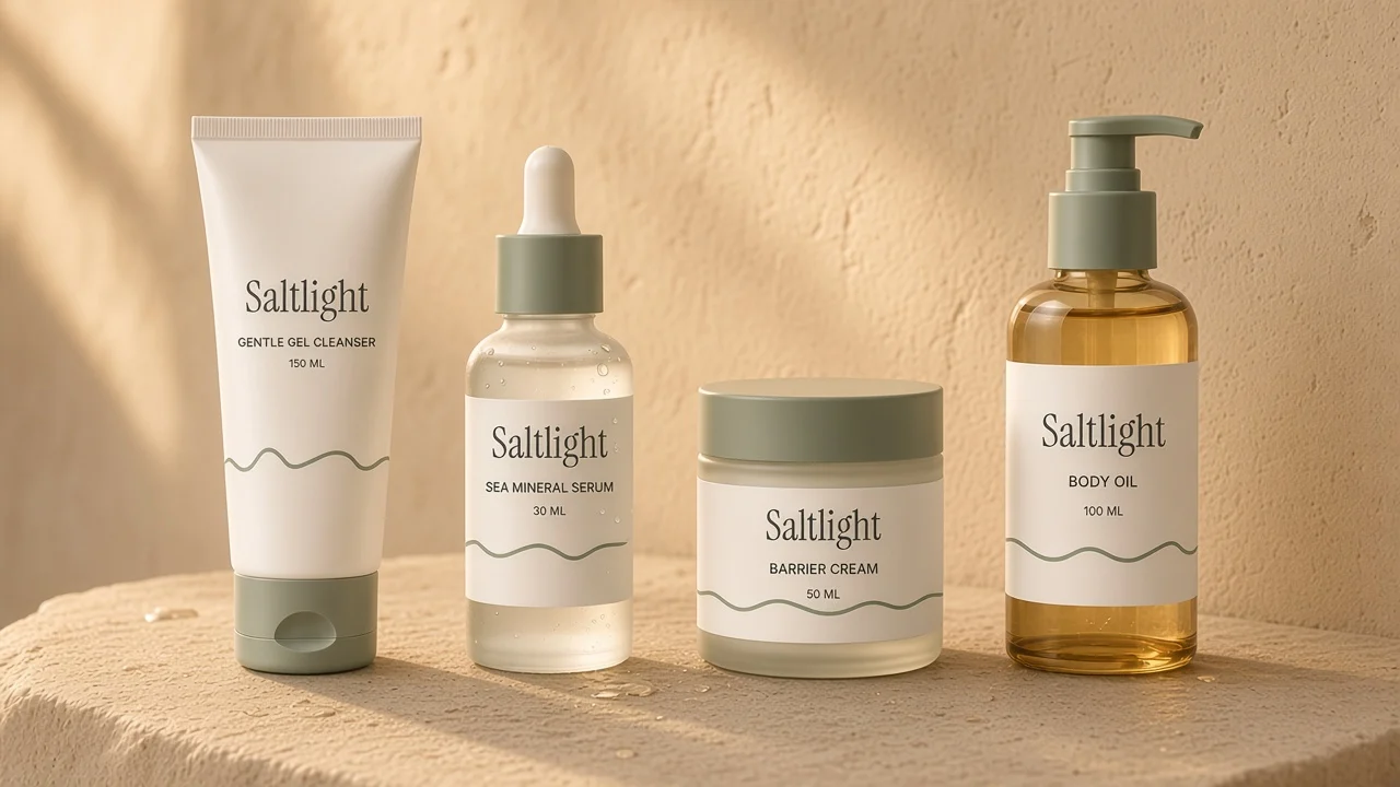
Photography
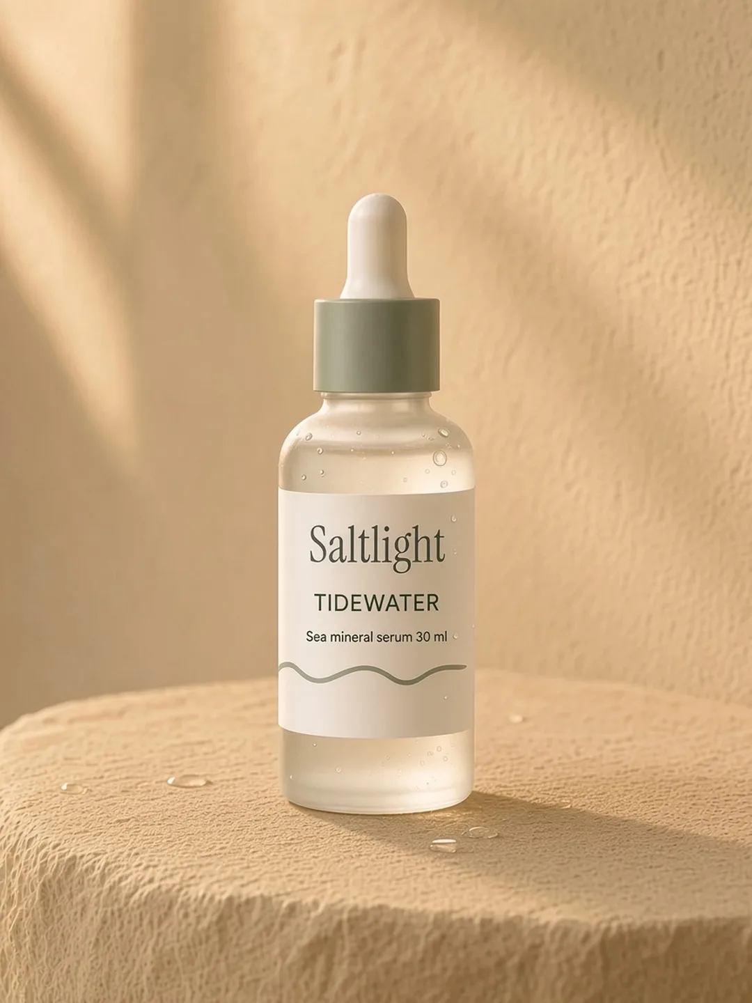
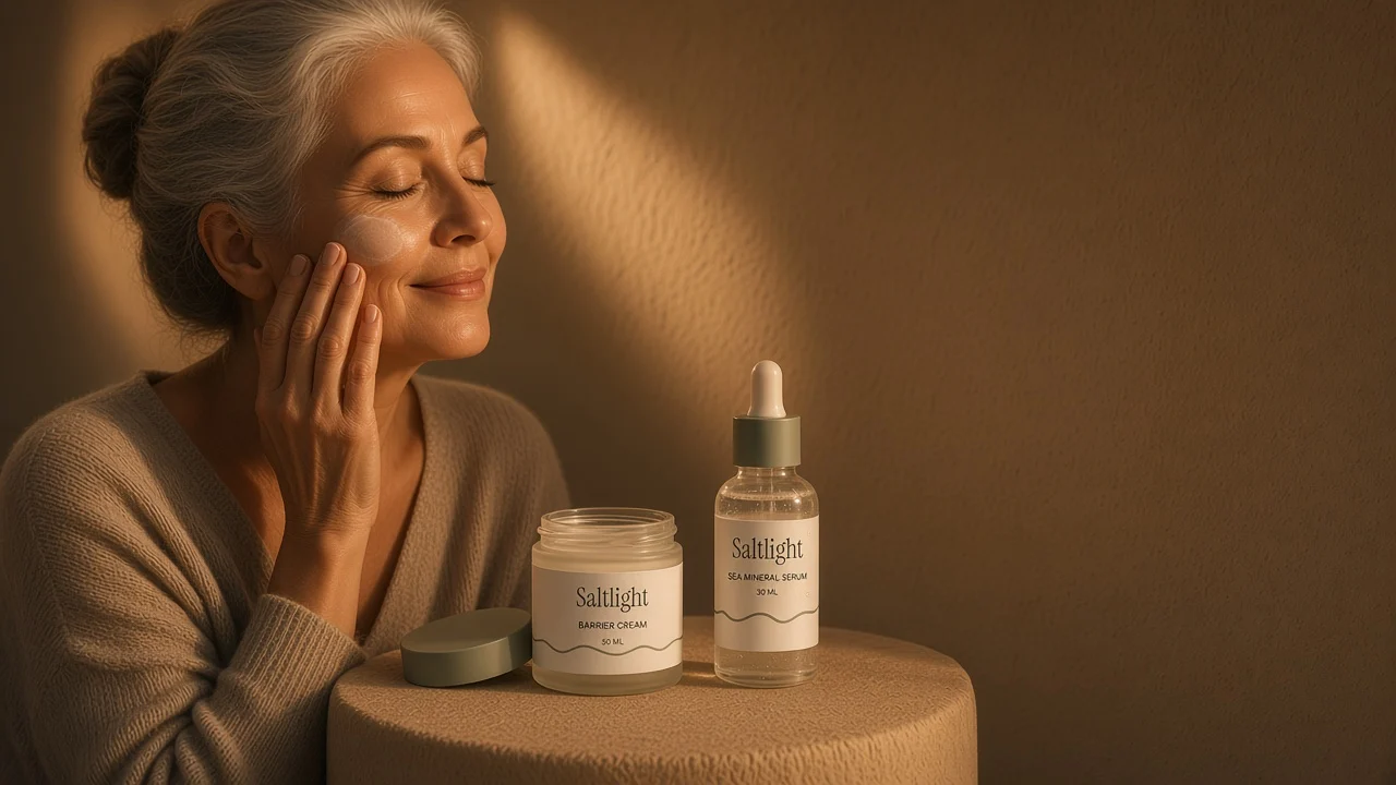
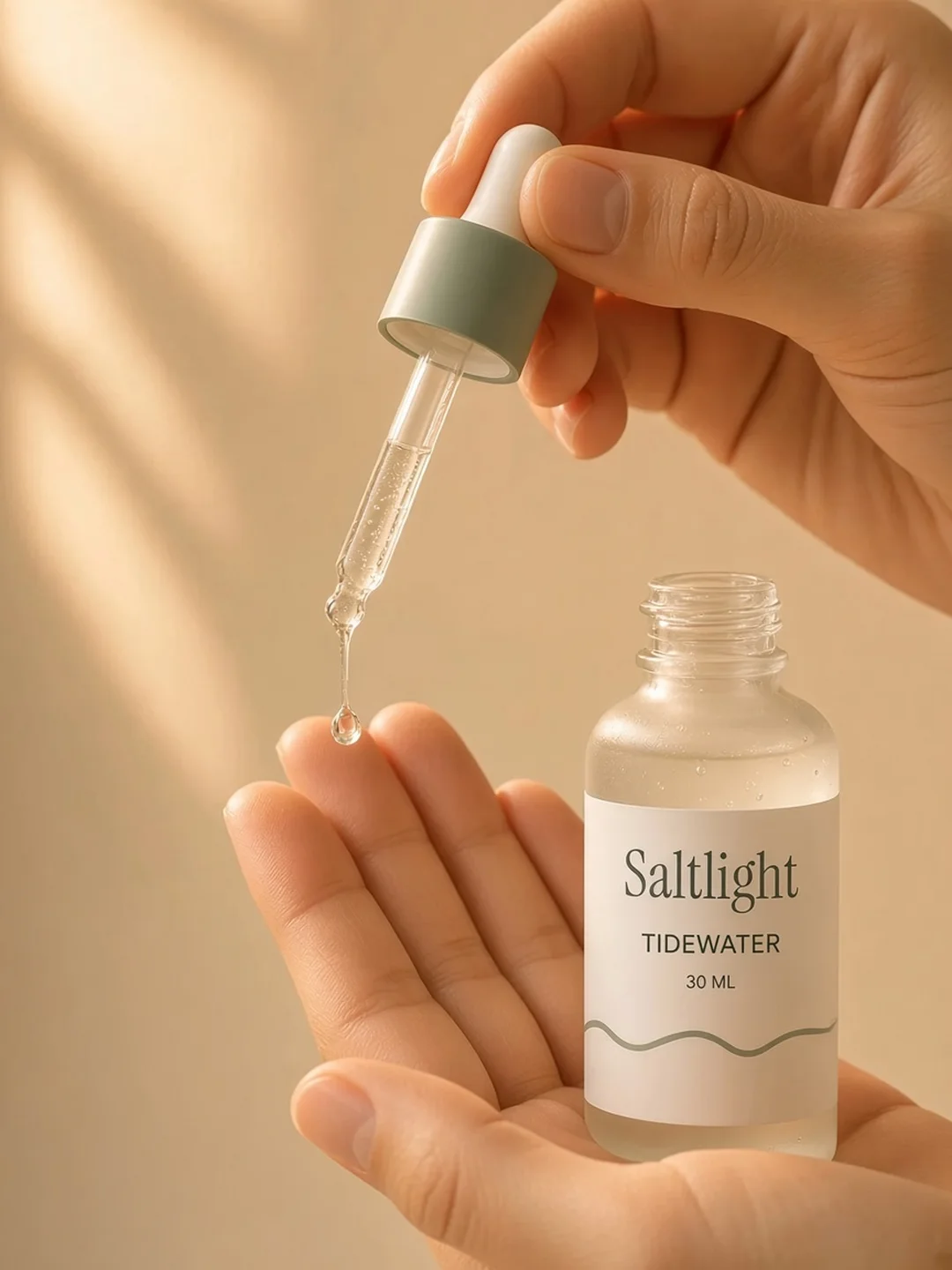
One master shot per bottle sets the label, glass and colour. Every scene is built from it: real bathrooms, a person in frame, soft sea light by day and one warm lamp at night.

Labels
Each label carries a big step number and its own tide line. Side by side, the four make one wave.
Box
Kelp green board printed with tide lines, the mark on the lid and the set name up the side.
Motion
Slow, like water. Nothing bounces.
Voice
Short and calm. Say what it does, how much to use, and stop.
We say
- Skin care with nothing extra.
- Two drops, pressed in.
- Fragrance free, every formula.
We skip
- Promises about results
- Before and after claims
- Exclamation marks